Friday, June 12, 2009

Progression

So it's been over a month since the last post, but, in weekends, that is only like 8 or 12 days. Seriously. If I looked at calendar I could count how many, but let's just get to the photos.


We'll start with our touchstone, Mr. Jack Baxter. He's the supervisor. We need something recognizable before launching into mystery...


Hmmm... What on earth?
..
..
..
..
..
..
..

Aha! It's the removal of ceiling paper! All painstakingly pealed off with a standard 1" razor blade. For a few hours, we were thankful the kitchen is as small as it is.

Upper cabinets! (Yes, these are the same cabinets we put in upstairs, but they are, in my humble assessment, the highest quality cabinets for the price that you can get. Also, technically, these are only the doors, as Husband made the boxes out of real wood instead of using the store bought melamine version).

Next up... carpentry. Casing for the archway, more properly called a cased opening. There also some more drywall work going on in the "fridge nook"


And now there is wall, but alas, picture is sideways. Maybe I'll fix that. Later.


Same faucet, different sink. Smaller, whiter, squarer.


Generally throughout this project we have not been without kitchen sink more than one day, but this last stretch we did let the sinkless state last longer than 24 hours. We had quite the back log of dishes. Here's the highlights of the dishwashing marathon:


Even baby helped.

So after sink come base cabinets.


After base cabinets come doors on drawers.


After base cabinets comes the supervisor to inspect.
(Ok, ok, this is out of order, the sink's not yet hooked in this image.)


Second to last, but not least: hooray for tile!!!
Shiny pretty tile!


And then... Last AND least: boo for dishwasher.


NOT visible in the image above, and not at all worthy of its own picture, is the dishwasher. The dishwasher arrived and was hooked up several days before the shiny tile appeared on the wall, but, alas... It was a brand-spankin' new, special-ordered, fancy-pants "panel-ready" dishwasher that doesn't work! Repair tech came out and declared its computer stupid, ordered a replacement, and will be back 8 days (8 days!) to repair the brand new machine. Stupids.

And here's the funny part. It's the same repair tech guy who came to fix the brand new fancy-pants range on the third floor when it didn't work out of the box. Different brand, different appliance, different store, something like a year and half ago, and yet, same repair nerd. Weird.

Teaser

Tile, dishwasher, cabinets, sink, loooooong faucet....

Saturday, May 9, 2009

Where we last left off...

When we left off, I believe the cat was slinking about the destruction. He still is.


Think of this as a recap blog, all those episodes of your favorite show that you missed, summarized in a few well-chosen snippets.

In our last episode, the original plan was to open up the wall nearly fully, but in this image you will see we found a surprise: large cast iron tube in wall!

Upon further inspection, we determined the tube was not an old gutter waste pipe, but in fact, a structural column that is holding up a good portion of the second and third floors.

We estimate the column was retrofit in the '30s, in response to some water damage (seen in the ceiling, previous image of cat slinking about). The water infiltration was likely caused indirectly by settling and directly by roofing issues. The pipe-column lines up with the outside wall of the second floor, and the old water stain in under the bit o' roof that bridges the gap between the outside wall of the second floor and the first floor. (If that doesn't make sense, just remember, it's a Queen Anne house, walls do not go front-to-back or up-and-down in a straight forward manner.) The house would have been 50 then, which is plenty of time to settle, making an unexpected valley in the mini-roof and allowing water to come inside and play. We reason that it was it happened in the 1930s, because a. there's plaster over it and b. there wasn't a lot of spare metal available for home improvement after about December 7, 1941.

The surprise did cause some initial head scratching, but we did some drawing and the plans will still work out. The net result is we must keep structural column and re-envision walllessness as a cased opening.

Onto the next event: remove wall cabinets. For the record, lead blogger Szonjaz did actually help out in this stage, as no fetus-harming dust, chemicals or heavy lifting was involved. I helped removed the content of the cabinets and squirrel them away.


Cabinets down!

A wall without upper cabinets. Note that the vent pipe (horizontal white tube near top of photo) projects out from wall, in former dropped ceiling space. That will have to be reckoned with. Stay tuned.


Header! (That's the beam that makes the cased opening able to not fall down.) Notice the swath of sunlight on the floor. The magic of opening up walls--the dining room now shares daylight with the mini kitchen.

For those of you with eagle eyes, you might have noticed in the header pictures that the floor has changed. The lovely hexagonal vinyl flooring was pulled up to reveal some mighty dirty oak below. The verdict is still out on sanding and refinishing versus painting.


This image is a little dark, espeically for those of you with PCs (sorry, ain't got time for photoshop), but the important things to notice are 1. diagonals of light making it into kitchen and 2. location of sink (that is its starting place).

Can you find the kitty ('kitty the monkey' as Alex called him)?

For extra points, there is something in this picture that will be gone in the final picture of this post. Can you find it?


Same sink, new location, 30" or so to the west. Note, too, that the vent pipe is properly located inside the wall (or what will soon be a wall and not just wood studs).

Lights! Level! Sheetrock!
I know the sink is invisible in this photo, but don't worry, it will reappear.

Look it all that gypsum board.

So that's the recap. This weekend's task is the beginning of cabinet making.

Thursday, March 19, 2009

ReShab

Get it? It's a pun...

Don't like puns? Well, let's start with a cliche then. Those who don't learn from their mistakes are destined to repeat them.

Another kitchen.
What? That looks like a green wall to me. Where's the kitchen?

Well, the kitchen is trapped behind the green wall. And it is our job to let loose the inner kitchen. So we will start by assembling kitchen items in the green room, and making a little plastic tent world.


Next you beat the living crap out of the little room that shouldn't be the kitchen anymore. It's not pretty. It's not even fun, and it's no job for pregnant people (putting those two words together makes me laugh) so I didn't take part in it.
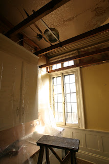
The wall with the large wound in it is the backside of the green wall, if you can imagine such things. So the not green backside of the green wall loses its plaster, and the dropped ceiling gets, well, dropped, as in, buh-bye. Happily there was nothing too terrible hidden in the ceiling--just a wonderful transom window we knew would be there, and some crazy wall paper (er, ceiling paper) that I could not coax my camera into photographing adequately. (Hint: click on photo to enlarge to reveal ceiling paper in all its glory.)


Well, to be fair to the man who did all the hard work, there was one surprise: loose fill insulation. The gray, toxic "snow flurries" made for a lot not-fun during the demo, but loose-fill is easier to get rid of then, say, a cast iron pipe or squirrel carcasses.

And here is the resultant chaos: green wall reveals its inner kitchen. It's going to a lot more therapy before true acceptance occurs.


Sunday, December 7, 2008

Saarinen

Saw this at the good ol' Walker, saw some fine Eero Saarinen drawings. This little plan is an executive office for the executive types at American Auto maker during their hey-day.
Here's the fun part: note the gun closet. Cars, modern architecture & guns--who'ld've thought they were so intricately connected.

Sunday, October 26, 2008

C'est fini!

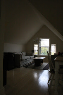
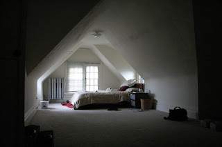
Well, well, well, we did the swap from treehouse to the nether apartment. I took some pics today of the treehouse, in its finished state. It looks pretty good. Especially noteworthy are the new treehouser's furnishings: it looks good stark. I have too much crap for the treehouse to ever have looked this good with me up there.

First the images with decent exposure:


And then the image I should have taken the time to correct in photoshop:


I would say the only thing lacking is some really colorful art work on the walls.

Tuesday, October 14, 2008